Outlier (Logo/T-Shirt Design Project)
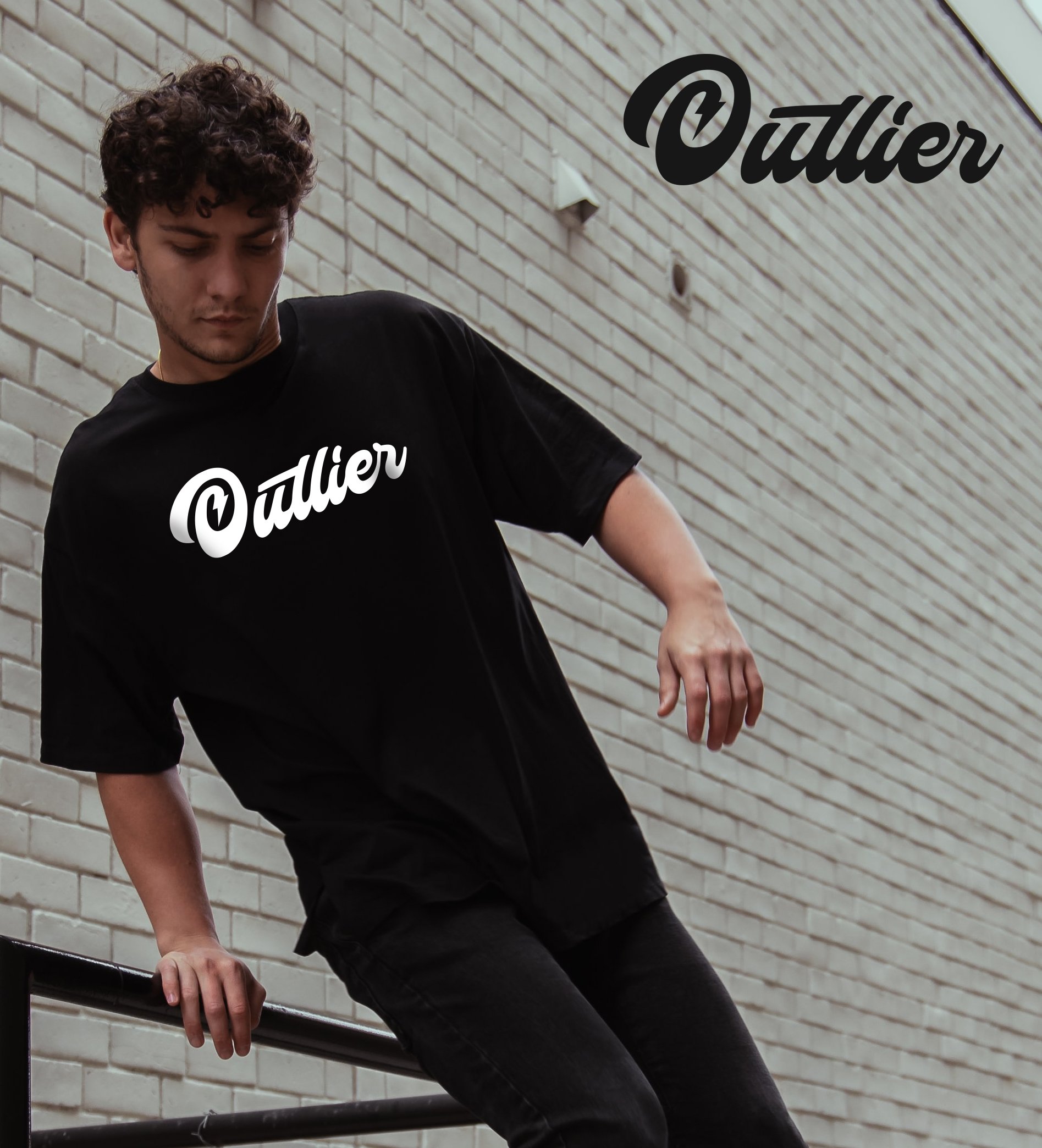
In this project, I experimented with a range of typographical elements to create minimalistic, text-focused logos for a skate/street wear brand. Drawing inspiration from iconic brands like Vans, I honed in on clean, refined letterforms while staying true to the client’s specifications.
Minimalist Typography: Each logo is rooted in simplicity, using refined letterforms to evoke a timeless aesthetic.
Experimental Flair: By playing with different typographical nuances, the designs bring an innovative twist to traditional street wear visuals.
Client-Centric Approach: Every element aligns with the client's vision, ensuring a cohesive brand identity that stands out in the competitive skate scene.
In this project, I experimented with a range of typographical elements to create minimalistic, text-focused logos for a skate/street wear brand. Drawing inspiration from iconic brands like Vans, I honed in on clean, refined letterforms while staying true to the client’s specifications. Paired with bold t-shirt prints, the designs strike a balance between experimental flair and urban simplicity—ensuring a cohesive and compelling visual identity that resonates with the skate culture. ✨🛹